 EN


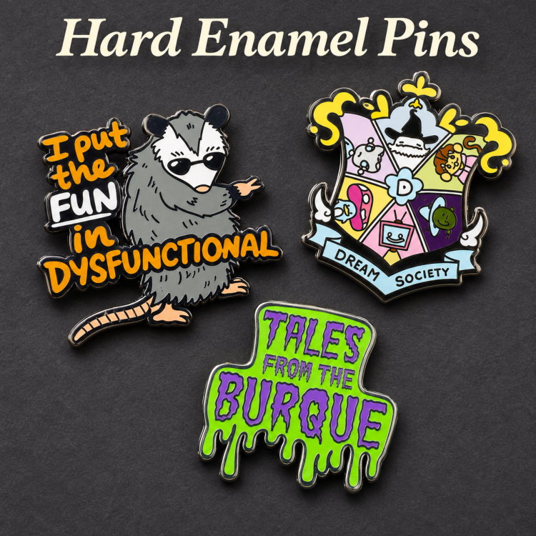
Creating a hard enamel pin starts with decisions that connect the artwork to its physical form. A thoughtful design phase considers scale, linework, color, edge detail, and how the finished piece will be worn or collected. These choices affect both visual clarity and the practical requirements that production must meet.
The most reliable approach is to plan design and manufacturing requirements together, rather than treating production as a final handoff. Consider where the pin will be used, what level of detail can remain legible at its chosen size, and whether a collection display should influence its shape or finish. Early decisions help prevent avoidable revisions.
Artwork Choices That Shape the Finished Pin
Scale, Silhouette, and Readable Detail
Begin by choosing a clear silhouette and a size suited to the artwork. The design should preserve the subject's defining features when viewed at actual scale, not only on a large screen. Fine lettering, narrow gaps, and tiny facial details can lose definition, so simplify them before preparing production art.
Use linework to separate color areas and establish a deliberate visual hierarchy. Borders need enough presence to define each shape without crowding the image. Ask how reduced detail will affect recognition, and review the artwork as a small physical object. This practical check makes the design easier to interpret and supports a smoother enamel pin manufacturing process.
Color, Finish, and Hardware
Select colors for contrast as well as brand or collection consistency. A controlled palette helps, especially when adjacent areas need to read as separate shapes. Think through how the metal outlines interact with the colors and whether a polished, matte, or other available finish suits the intended look.
Hardware is another design decision, not an afterthought. Consider where the pin will attach, how much weight the garment or accessory can support, and whether the back should remain comfortable during wear. If display is part of the intended use, the fastening method should also allow secure handling without making removal difficult.
A useful design brief records the intended dimensions, colors, surface appearance, and attachment needs in one place. That brief gives everyone a shared reference when reviewing revisions. It also keeps the custom enamel pin design focused, so decorative additions do not undermine legibility or create details that are difficult to reproduce.
B2B Design Checklist: Specifications to Lock Before Tooling
Most revision cycles trace back to specifications that were never written down. The checklist below covers the parameters that should be confirmed in writing before a mold is cut or a proof is approved.
| Parameter | What to Specify | Practical Rule of Thumb | Why It Matters |
|---|---|---|---|
| Finished size | Width × height in mm, measured at the widest points | Keep smallest text ≥1.2 mm cap height at final size | Detail that reads on screen often collapses at 25–30 mm |
| Metal line width | Minimum border and divider thickness | Avoid lines under ~0.3 mm; widen dividers between similar colors | Thin lines become fragile and hard to fill evenly |
| Enclosed color areas | Smallest cavity that must fill cleanly | Simplify compartments under ~1 mm; merge or open them | Tiny cavities fill unevenly and show after polishing |
| Color count | Number of enamel colors plus metal tone | Cap the palette; use metal as a color where possible | Each added color adds fill steps and mismatch risk |
| Plating | Gold, silver, black nickel, dyed, etc. | High-contrast plating makes surface flaws more visible | Plating tone shifts how neighboring enamel colors read |
| Finish | Polished / matte / textured / epoxy dome | Match finish to handling and viewing distance | Finish affects perceived quality and wear visibility |
| Attachment | Butterfly clutch, locking back, magnet, etc. | Match back type to garment weight and removal frequency | Weak hardware fails before the pin body does |
| Tolerance | Acceptable variation in size, color, fill | Agree numeric ranges, not adjectives | Turns subjective approval into a checkable standard |
Practical takeaway: the rows that cause the most rework are line width, enclosed color areas, and color count. Settle those three first, then confirm plating and attachment against the actual wearing context.
Production Decisions to Settle Before Approval
Preparing Artwork for Manufacturing
The production stage translates digital artwork into defined metal borders and filled color areas. Before approval, clarify which lines form boundaries, which areas receive enamel, and how the selected finish should appear. Artwork prepared with distinct, unambiguous shapes gives production teams a clearer basis for interpreting the intended result.
Review artwork at its final dimensions and confirm that small openings, thin strokes, and close color boundaries remain workable. Adjustments may be required where the original illustration relies on extremely fine features. Resolve those questions before authorizing production, rather than assuming every screen detail can be reproduced unchanged.
Sampling, Tolerances, and Revision Control
A sample or production proof can help stakeholders assess proportion, color relationships, and overall finish before a larger run proceeds. During this review, compare the result with the approved artwork and record specific changes. Feedback is easier to act on when it identifies a location and a clear desired adjustment instead of relying on general comments.
Agree on the details that matter most — size, shape, finish, and acceptable variation — before approval. This does not mean every pin will be identical in every microscopic detail; it means expectations are understood. Organized review notes reduce ambiguity across revisions and support more consistent decisions.
Keep one approved file and a dated record of changes so outdated artwork does not re-enter the workflow. This simple control is useful when several people review the project or when the design belongs to a recurring series. It also makes production more predictable by linking feedback to a specific version.
Use, Presentation, and Collection Planning
Matching the Pin to Its Real Setting
Think about the conditions in which the pin will be worn or handled. Clothing, bags, event credentials, and display boards impose different needs for size, attachment, and visual impact. The design should suit the intended setting, while production should account for the agreed construction and finish.
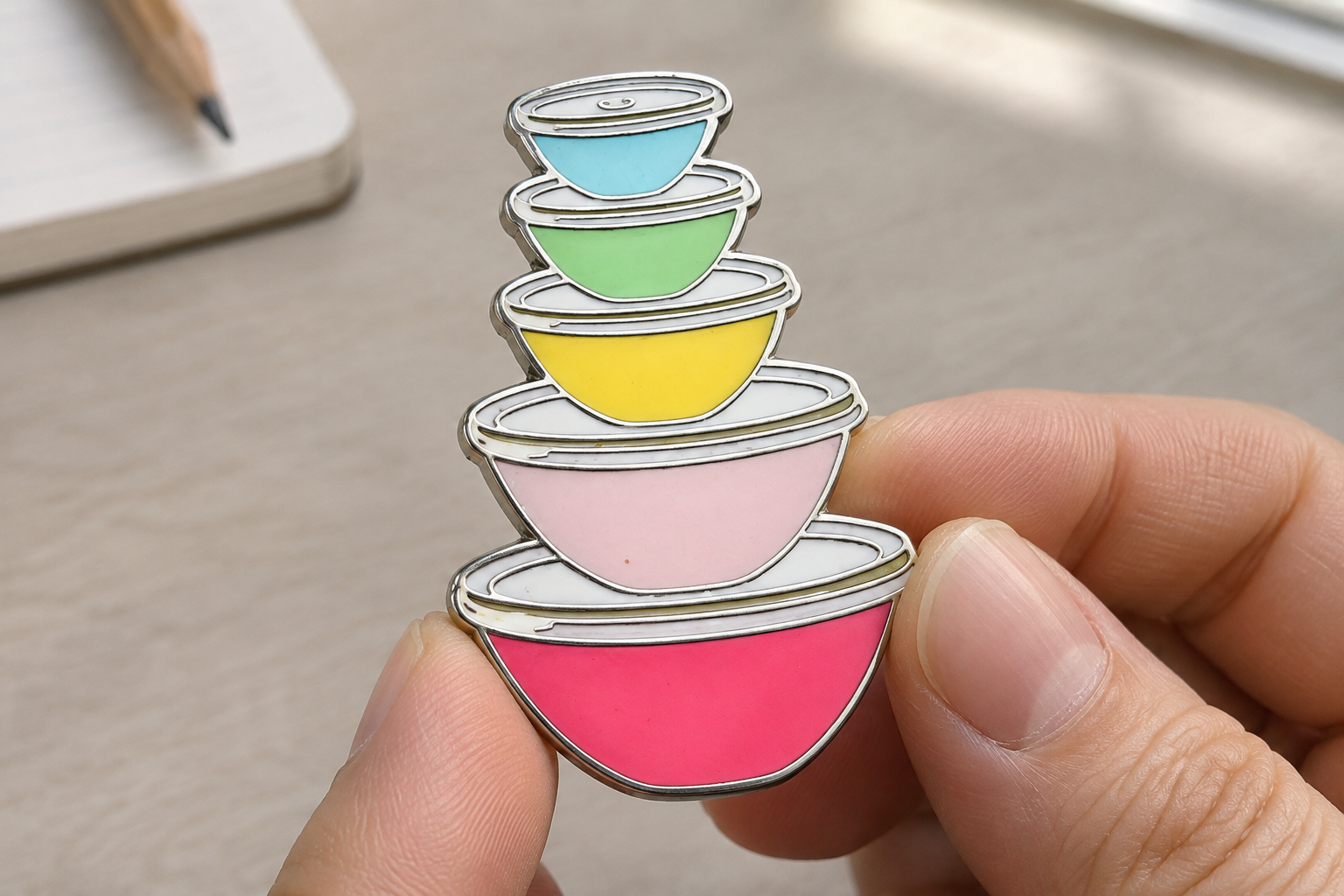
If the pin will join a custom enamel pins collection, consider how its outline and palette will sit beside other pieces. Consistent dimensions can help a series feel coherent, while a distinct silhouette can make an individual release easy to identify. Two display-focused decisions worth settling early are spacing and orientation, since both affect how the artwork reads when mounted.
Planning a Display That Protects the Design
A display can be a framed board, a fabric panel, a case, or another format suited to the collection and its environment. Choose a surface that holds the pins securely and allows viewers to see their details. Leave enough room for fingers to remove a piece when access matters, and avoid arrangements that force pins to overlap.
Plan the visual order before mounting. Grouping by theme, color, or release can make a display easier to understand, while consistent spacing creates a calmer presentation. For an expanding collection, leave a little room for future additions rather than filling every available area at the outset.
Documenting the layout helps maintain the arrangement when pieces are moved for events, photography, or storage. Use the approved artwork and product details to label pieces if identification matters. Display planning also feeds back into design: repeated shapes, complementary colors, and a shared visual theme can make a series feel intentional without making every pin look alike.
FAQ
What artwork details need the closest review?
Check the silhouette, lettering, narrow gaps, and color boundaries at the finished size. The design should communicate clearly at a glance, and production needs defined shapes that can be interpreted consistently. Review the proof against the approved art before confirming production.
When should production feedback be provided?
Provide feedback after reviewing the proof or sample and before giving final approval. Specify the exact area and requested change. This makes the process easier to follow and helps avoid confusion between current and outdated files. Keep comments consolidated when several reviewers are involved.
How can a display plan influence the design?
A planned display can guide choices about dimensions, orientation, color relationships, and whether a release should connect visually with existing pieces. Consider spacing and viewing distance before finalizing the artwork. A design that suits both its intended use and its display context is easier to present as part of a coherent collection.